

Whether you're in L&D, IT, or Ops, you've probably spent hours creating detailed software workflows in your CRM, ERP, HRMS, or any other enterprise tool, only to see adoption fall short.
The problem isn’t the workflow. It’s the gap between the workflow and the user doing the task in real time.
Most users don’t need more documentation. They need in-the-moment guidance, right where the work happens (in the software itself).
Which is exactly why in-app walkthroughs exist. And whether you’ve never heard of them or you’re already using them somewhere, this blog is your full deep-dive.
In this blog, we’ll break down:
- What Is a Software Workflow?
- How Software Workflows Are Shared Today
- Why Just Building Workflows Isn’t Enough for Adoption
- What’s an In-app Walkthrough?
- Why Walkthroughs Need to Sit on Top of Workflows?
- How To Design Walkthroughs for Real Software Workflows?
- Bonus Tip (don't miss out!!)
- Endnote: How to Go From “How Do I Do This?” to “Done.”
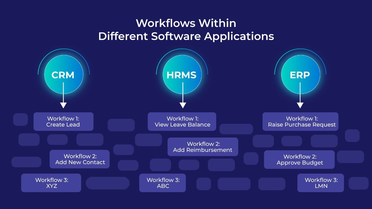
What Is a Software Workflow?
Here’s the definition:
A software workflow is the structured, step-by-step path a user follows inside an application to complete a specific business task or process.
Here, by business task or process, we mean any repeatable activity that keeps operations running like creating a new lead in a CRM.
For example, when a sales executive uses CRM, a common software workflow might look like this:
- Click “New Lead.”
- Enter the prospect’s name and company
- Choose a lead source
- Click “Save.”
This example may appear short and simple, with just four steps, but actual workflows can be much longer. We've seen ones with up to 157 steps, including complex conditions and different flows based on roles or inputs.
The more workflows a system has, the harder it becomes for users to remember them all. And that’s when the trouble starts:
- Learning curves grow longer than they need to
- Data gets mis-entered, half-entered, or forgotten altogether
- And suddenly everyone’s dependent on that one colleague who magically knows how the process works
How Software Workflows Are Shared Today
While most teams build workflows into their software, those workflows often aren’t conveyed clearly, especially during training or rollouts.
So what happens?
Teams resort to workarounds. Here are a few common ones:
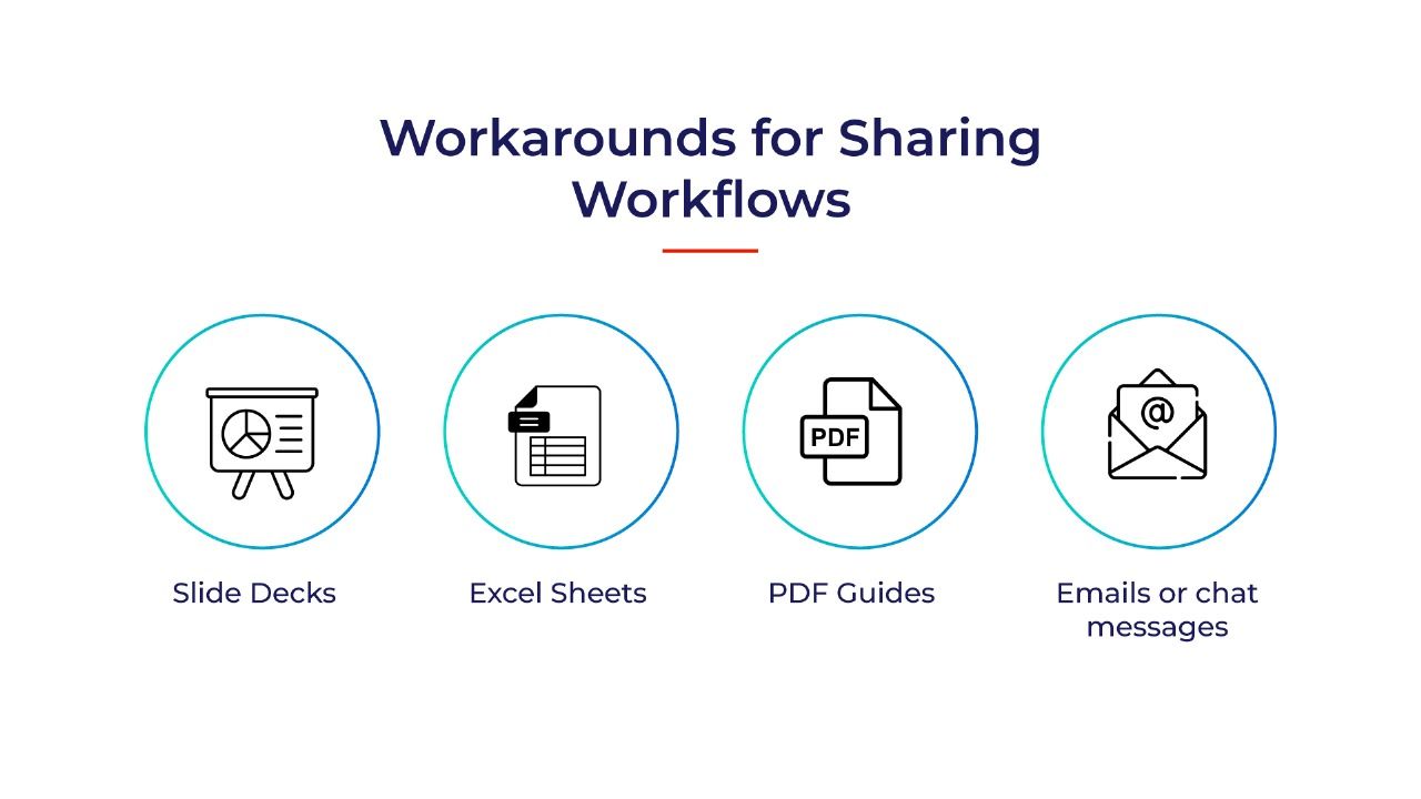
- Slide decks with annotated screenshots: “Step 1: Go to this tab. Step 2: Click that button. Step 3: Fill this field.”
- Excel sheets with detailed instructions: Often used for process documentation or QA training.
- PDF guides or handbooks: Still surprisingly common for compliance-heavy processes.
- Emails or chat messages with one-off instructions: Quick, informal, and easily lost in the noise.
Why Just Building Software Workflows Isn’t Enough for Software Adoption
Sure, the formats listed above have evolved from corporate training paper manuals, but they still have one big flaw:
They live outside the application. They are EXTERNAL.
When an user is actually trying to complete a task (such as creating a lead, submitting a reimbursement, or approving a budget), they have to switch contexts, jump between tools, or try to recall what they saw in LMS training.
That’s friction.
And friction is the enemy of any kind of software adoption. That’s where in-app walkthroughs come in.
So, What’s an In-App Walkthrough?
An in-app walkthrough is a guided, step-by-step overlay inside a software application that shows users exactly how to complete a task. It removes guesswork, reduces errors, and helps users feel confident as they work through unfamiliar screens or multi-step processes.
To make the guidance clear and easy to follow, walkthroughs use a mix of visual cues and interactive prompts, and in some cases audio explanations for additional clarity.
These can include:
- Highlighted fields or buttons
- Callouts and short instructions
- Checklists that move as the user progresses
- Optional voiceovers that explain what’s happening on screen
With this kind of guidance in place, users don’t have to memorize steps or depend on someone else. They simply access help within software interface, choose what they want to do, and follow the instructions in the flow of work.
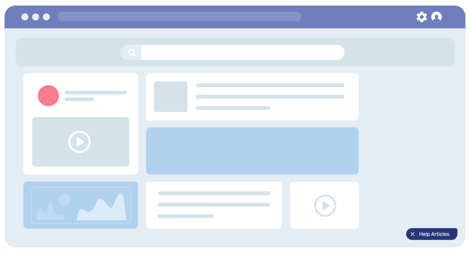
Currently, digital adoption tools help create such in-app walkthroughs. In Salesforce interface, for example, it might look like below.
With Gyde, L&D and training teams can build in-app walkthroughs, without writing any complex codes. The platform uses AI to capture steps automatically, generating voiceovers from text (with quick re-records), translating workflows into multiple languages, and even converting them into downloadable video tutorials.
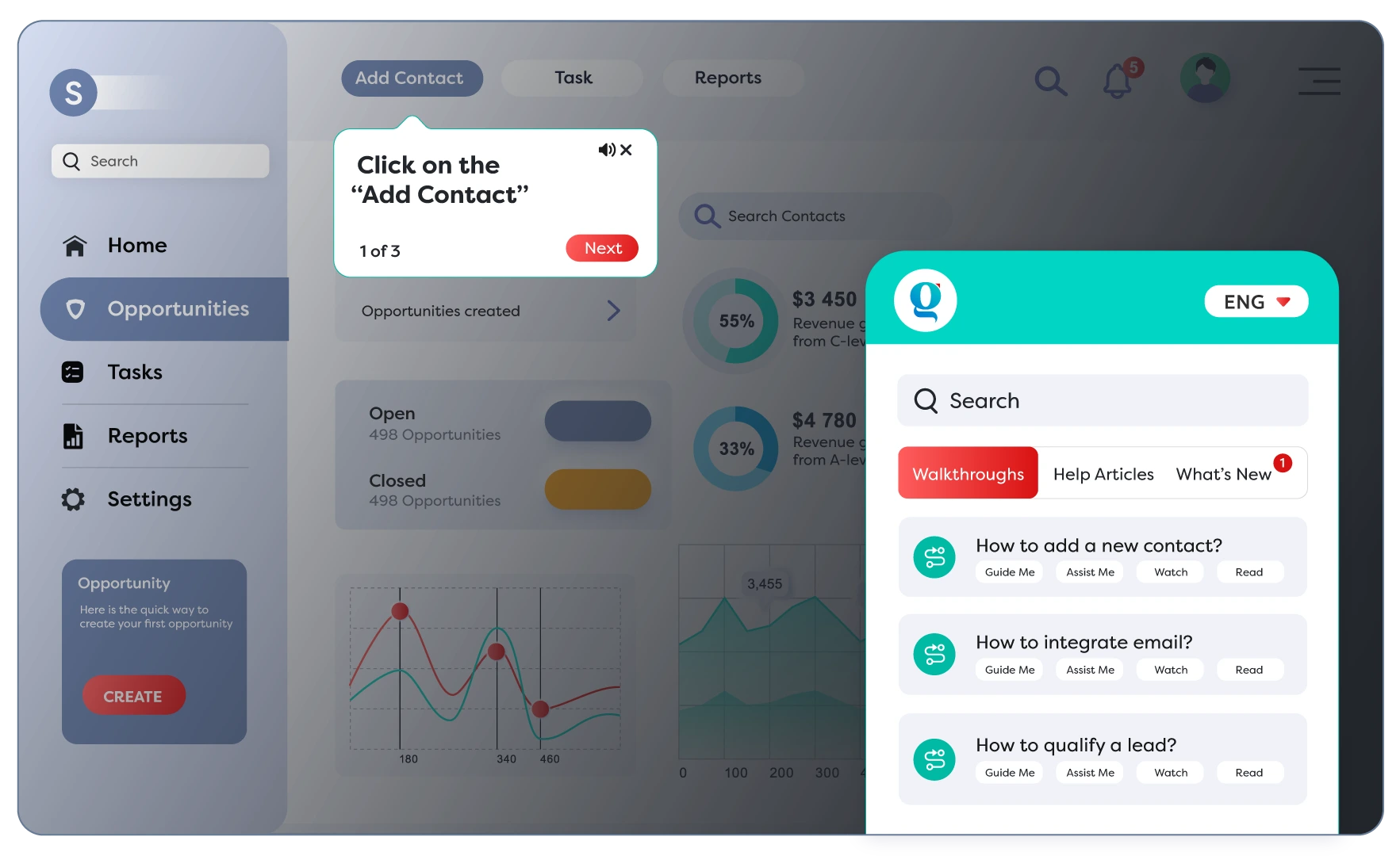
Gyde’s in-app help panel gives users multiple ways to learn a software workflow, depending on their experience level and learning preference:
- Guide Me – Opens a full interactive walkthrough, guiding users step-by-step from start to finish.
- Assist Me – Ideal for experienced users. It lets them jump directly to the step where they’re stuck, instead of restarting the whole walkthrough.
- Watch – Plays an auto-generated video version of the workflow for quick visual learning.
- Read – Opens a how-to guide with screenshots and text, perfect for users who prefer scanning instructions or self-help.
Why Walkthroughs Need to Sit on Top of Workflows
Workflows tell users what to do. But they don’t always help with how or when, especially when the system is new or the task is unfamiliar.
That’s where walkthroughs come in.
They sit right on top of the workflow, guiding users step by step, inside the app, in the moment they need help. No switching tabs, no second-guessing.
A good walkthrough doesn’t just point out buttons. It gives clarity. It tells the user what’s expected, flags what’s missing, and nudges them forward.
The goal isn’t just task completion. It’s confidence. Repeated use. And fewer mistakes along the way.
Workflows show the path. Walkthroughs walk it with you.
How To Design In-App Walkthrough for Software Workflows
This part is more on the creator’s side.
If you’re the one designing the experience (whether you’re from L&D, Ops, or IT), this section gives you a clear starting point.
We’ll look at:
- How to spot the workflows that need support
- How to prioritize them
- And how to build walkthroughs that act as ongoing guidance.
The goal is to give users something they can return to. Something that makes them confident each time they open the tool. Something that sticks.
1. Start With the Workflows That Trip Users Up
You don’t need to document everything on Day 1. Start with the workflows that users struggle with the most.
Here’s how to spot them:
- Ask your support team about the questions that come up repeatedly.
- Check training feedback: Where do users drop off or get stuck?
- Look at app analytics: Where are tasks left incomplete or abandoned?
- Listen to frontline managers. They’ll know which processes take too much handholding.
You're not looking for the most important workflow. You’re looking for the most painful one, the one that makes users ping someone for help or delays progress.
Start there. Make that smoother. That’s where walkthroughs will have the most impact.
2. Prioritize What’s Frequent, High-Impact, or Easy to Mess Up
Once you’ve listed common workflows, not all of them need a walkthrough right away.
Focus on the ones that are:
- Used often (e.g., logging a lead, submitting a leave request)
- Business-critical (e.g., updating deal stages, raising a purchase request)
- Easy to get wrong (e.g., selecting the wrong category, missing required fields)
You can use a simple filter: If a mistake here leads to bad data, delays, or frustrated users, it’s a candidate for a walkthrough.
Sometimes, a short daily task needs support. At other times, it’s a rare yet complex one. Don’t go by size. Go by how much smoother it’ll make someone’s day.
3. Break the Workflow Into Steps That Feel Natural to Follow
Once you’ve chosen a workflow, break it down into steps that accurately reflect how users actually navigate through the system. Each step should guide one action:
- Click a button
- Fill a field
- Select a value
- Save the form
With Gyde DAP, this is easy as it uses Gen AI to capture screens, identify elements, and draft instructions as you click through the process. So if you click into a field named “First Name,” Gyde instantly fills in:
- Step Title: Enter First Name
- Description: Please enter your first name in this field.
It saves creators time, keeps steps consistent, and helps walkthroughs feel polished, even at scale. You still have full control to edit or reword, but the heavy lifting is done.
With its no-code walkthrough creator gives your team full control over how each step behaves:
- Choose where the callout appears (right, top, left…)
- Decide whether users must interact with the element or just read the info
- Add a delay or scroll to bring attention to a specific section
- Mark critical steps that users shouldn’t skip
You can even add a voiceover to each step, so instructions are not just seen, but also heard. Gyde also lets you translate walkthroughs into multiple languages automatically. This ensures users across regions access the same guidance in their preferred language without recreating content from scratch.
4. Use Logic to Keep It Relevant
Not every user needs the same path. Someone in Sales may need all six steps. Someone in Customer Support might only need two. Walkthroughs need to adapt.
Gyde lets you set rules and branching logic right inside the builder:
- Element-based triggers: Show a step only if a specific element is present or clicked
- User input checks: If a value is entered a certain way, jump to a different step
- DOM-based filtering: Tailor the flow based on what’s on the screen.
You can also add custom buttons in a message box, letting users choose where to go next:
Example: “Update Contact Info” or “Skip to Lead Notes”, each takes them to a different part of the walkthrough.
Of course, it’s granting flexibility. But it’s also keeping things clean and relevant, so users only see what matters to them, and nothing more.
5. Test It Like a User, Not a Creator
Once your walkthrough is built, don’t just preview it. Use it like a first-time user would.
You’ll catch things you didn’t notice during setup.
Here’s what to check:
- Does the timing feel natural, or too fast?
- Are the instructions clear, or do they assume too much?
- Is the language easy to follow, or too internal?
- Do any steps feel unnecessary or interruptive?
Also test edge cases:
- What happens if a user skips a step?
- If a field is already filled, does the logic kick in and skip ahead?
- Does the custom button lead to the right step?
Gyde makes this easy. You can trigger the walkthrough in-app and experience it exactly as your users would. If something feels off, tweak the step conditions, update the voiceover, or reposition the callout, right from the backend.
Bonus Tip: Phrase Workflows the Way Your Users Would Search
You’ve built the walkthrough. It works. It’s smart. But can users find it?

As shown here, users can:
- Search using natural terms like “add new team member” or “update contact”
- Choose how they want to learn a software workflow (whether by following a walkthrough, reading an article, or watching a video)
- Launch guidance exactly when they need it, even mid-task, so they can complete the workflow confidently and remember it over time
But this only works if you’ve named workflows in the language your users use.
Not internal jargon. Not process names. Think how they’d type it in the search bar.
Say: “How to create a new contact”
Not: “CRM Contact Entry Workflow v2.3”
Simple, searchable phrasing = faster access, more usage, fewer hand-holding moments.

Plus, walkthrough related analytics show training creators exactly what their users do within software tools.
For example, Gyde’s analytics give you visibility into how users behave inside your software application, what workflows they search for, where they get stuck, and which steps slow them down.
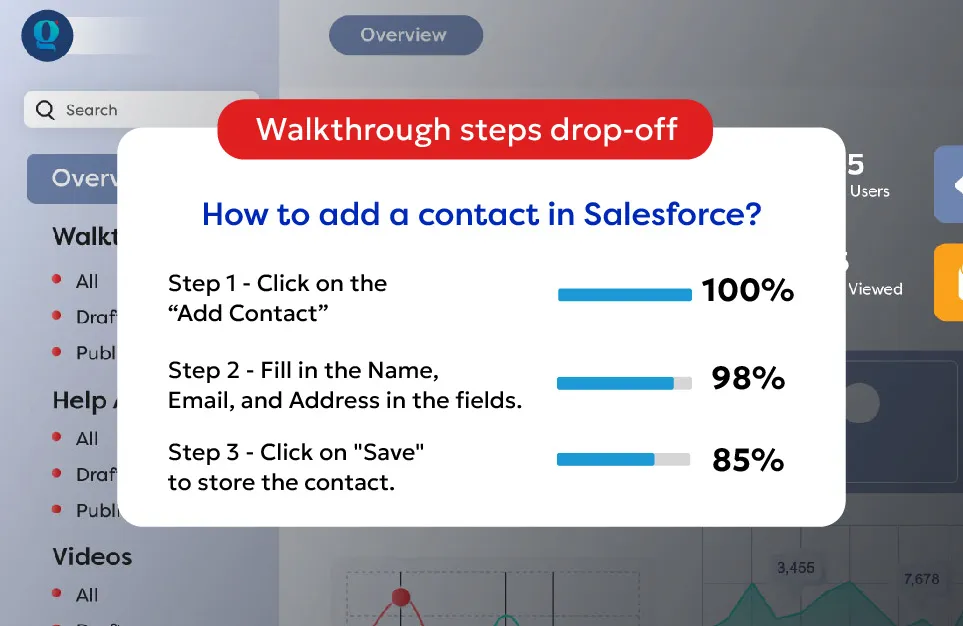
This helps you:
- See which walkthroughs, videos, and guides get the most (and least) engagement
- Identify exactly where users struggle or abandon a process
- Improve training and workflow design with data-backed decisions
In other words: Analytics tell you what users need (and what to fix next) without guessing.
From “How Do I Do This?” to “Done.”
When done right, in-app walkthroughs don’t just explain software; they clear the path for users to do their job confidently, accurately, and without second-guessing.
They’re part onboarding, part reinforcement, and part training — all rolled into one smart, self-serve layer.
And if you're thinking:
"This sounds great, but we don't have the time or team to build it from scratch."
That’s exactly where a tool like Gyde help. Teams across Salesforce, SAP, and other enterprise systems use Gyde to reduce support tickets, improve data quality, and shorten onboarding dramatically.
One example: a large BFSI organisation like Muthoot Fincorp used Gyde to guide thousands of frontline users through their customer acquisition system in their language, in real time, and right inside the workflow.
They saw:
- 78% fewer data errors,
- 63% faster onboarding,
- over 70% adoption across branches.
That’s the power of giving users contextual guidance exactly when they need it.
Gyde helps organisations create in-app walkthroughs, maintain higher data hygiene, and build a workforce that feels confident navigating complex software workflows from day one.
If you’d like to experience this firsthand, we’ll help you build your first set of walkthroughs on your actual workflows and provide hands-on training to your team for creating and managing them confidently on their own.

Before you go, one question:
What’s one workflow in your organisation that could transform productivity if it simply had a walkthrough today?
FAQs
1. What’s the difference between a tooltip and a walkthrough?
A tooltip is typically a one-time message associated with a UI element. A walkthrough is a structured, step-by-step guide that walks users through an entire workflow or task. Walkthroughs offer context, sequencing, and logic — far beyond a static tooltip.
2. Do walkthroughs slow down the user experience?
Not when designed well. In fact, they reduce hesitation, prevent mistakes, and often speed up task completion by offering just-in-time support. The key is to make them feel like an assist, not an interruption.
3. How do I know if users are actually using the walkthroughs?
Platforms like Gyde offer analytics that show which walkthroughs are launched, completed, or skipped, helping you refine the content based on real usage data.
4. Can in-app walkthroughs support multi-language teams?
Yes. Tools like Gyde let you add voiceovers and instructions in users’ preferred languages and accents, making them more inclusive and accessible for global teams.
5. Do I need a developer to build walkthroughs?
No. Most walkthrough tools are designed for non-technical users, typically individuals in L&D, Operations, or Product Development. You can use point-and-click interfaces to create, test, and launch guides without writing a line of code.
6. Can walkthroughs be used for external users, such as customers or partners?
Absolutely. If your software is used by clients, vendors, or partners, walkthroughs can improve their onboarding and reduce your support workload. Just ensure the content is tailored to the audience.
7. How often should we update walkthroughs?
Ideally, update them whenever a UI or process changes. Some tools offer alerts or even auto-detection features that flag outdated steps, ensuring your guidance remains accurate over time.